Designing Trust, Comfort, and Elegance for Modern Parenting with Pea Pod.
About the Brand
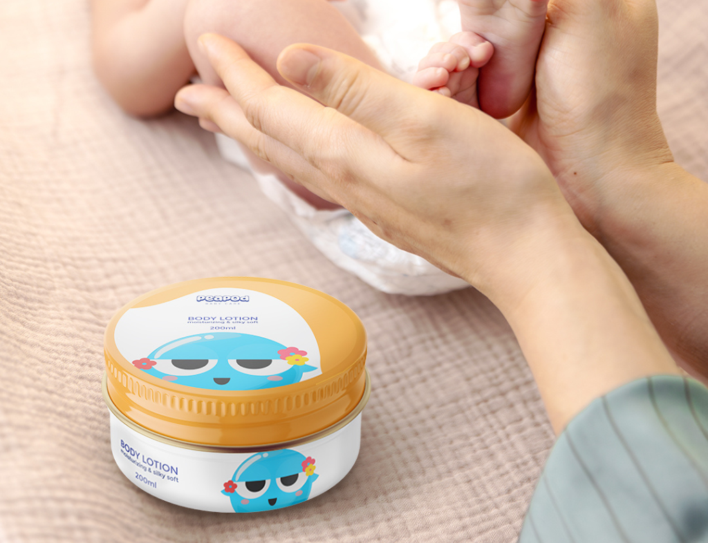
The pea refers to a new born baby and the pod represents the mother’s womb. The concept of the name is that our products priortizes on the comfort that a baby feels in the mother’s womb.The brand creates products that are chemical free, 100% natural and nurtures your baby with the same mother’s love and protection.
The solution
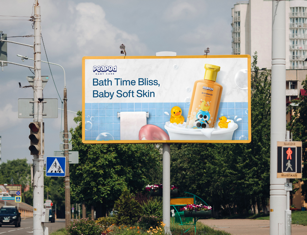
To bring Pea Pod’s vision to life, we developed a branding strategy that blended warmth, softness, and elegance. We crafted a soothing color palette, minimalist yet playful typography, and organic design elements to reinforce the brand’s natural and baby-friendly identity. The packaging was designed to be visually appealing, practical, and informative, ensuring a seamless experience for parents.
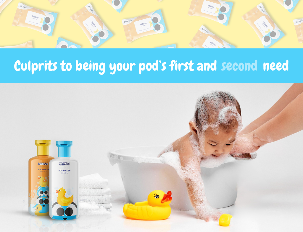
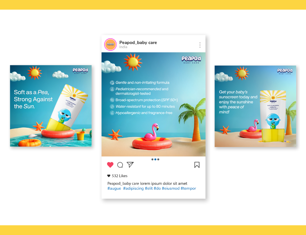
On social media, we curated a content strategy that resonated with modern parents—educating, engaging, and building trust. Through thoughtful storytelling and cohesive design, Pea Pod now presents itself as a trusted, premium baby care brand that embodies both nature and sophistication.
The ask
Pea Pod, a baby care brand, sought a complete branding and design solution that would capture its essence—natural, baby-friendly, and sophisticated. They wanted a visual identity that would instill trust in parents while maintaining a refined, modern appeal. From branding to packaging and social media, the goal was to create a cohesive presence that reflected the purity and gentleness of their products while standing out in a competitive market.